Your website is often the first impression people get of your brand. It’s not just a place to park your information online; it’s your virtual handshake, your storefront, and sometimes even your customer service team, all in one. A website that really “works” is one that looks good, functions smoothly, and makes people feel welcome right from the start. With Shyft Digitally’s website development services, you can ensure your site is responsive, easy to use, and built to set you up for success.
Beyond design, SEO services are essential to make sure your site doesn’t just look great but is also optimized to appear at the top of search engine results, helping potential customers find you easily. Let’s walk through the essential ingredients of a website that people will love – and keep coming back to. From making sure it looks great on any device to structuring it in a way that search engines can easily find, these tips, along with Shyft Digitally’s expertise in website development, will help you create a site that’s both welcoming and effective.
Optimized for All Devices: Seamless Experience Across Platforms
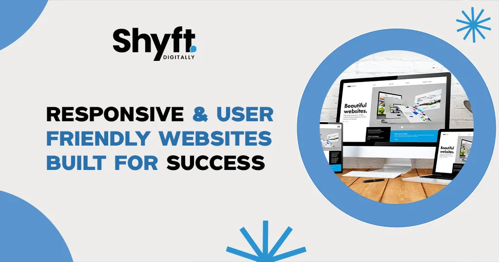
Let’s face it – everyone’s on their phones these days, but people also browse on tablets, laptops, and even smart TVs. A responsive website is one that looks and feels great on any device, whether it’s a big desktop monitor or a small phone screen. And it’s not just about resizing things; it’s about making sure the experience feels natural, no matter where or how someone is browsing.
When a site adapts to different screens, it’s like saying to your visitors, “We’re here for you, no matter how you choose to visit us.” Google also loves mobile-friendly sites, which means going responsive can help your search rankings. So, whether someone’s scrolling on their phone while waiting in line or browsing on their laptop at home, a seamless experience shows you’re ready to meet them wherever they are.
Enhanced Usability: Prioritizing the User Journey
A website can look amazing, but if it’s hard to use, people won’t stick around long enough to see what you have to offer. Usability is all about creating a smooth, easy journey that visitors can follow without getting frustrated or lost. Think of your website as a guide for visitors, helping them find what they need, whether that’s learning about your products, finding contact info, or completing a purchase.
Clear menus, strong calls to action, and well-organized content make a big difference. Usability is like setting up your home for guests – you want it to feel comfortable, welcoming, and easy to navigate. When people feel at ease on your site, they’re more likely to stick around, explore, and return.
A great way to make sure your site is usable is to ask real people to try it out and give you feedback. Watching how they interact with your site can tell you where things are working well and where they’re getting stuck. The easier your site is to use, the more likely it is to turn visitors into loyal fans.
Fast & Efficient: Built for Speed and Reliability
We’ve all experienced the frustration of waiting for a slow website to load. Studies show that if a page takes longer than three seconds, most people will leave. A fast and efficient website is a must to keep visitors engaged and happy.
Speed matters for search engines, too. Google favors sites that load quickly, so if your site is lagging, it might not rank as high in search results. To make sure your website is speedy, try optimizing images, minimizing extra code, and using caching tools to keep things running smoothly. And don’t underestimate the power of a reliable host – a good hosting provider is key to keeping your site fast and available.
A fast website is like rolling out the red carpet for visitors. It shows you respect their time and want them to have the best experience possible.
Accessibility at the Core: Inclusive Design for All Users
A truly welcoming website is one that everyone can use, including people with disabilities. Web accessibility is about making sure that no one is left out. This could mean adding Text descriptions for images so that screen readers can pick them up, creating buttons that are easy to click, or making sure your fonts are readable for everyone.
Accessibility is also good for business. It widens your audience, improves the experience for everyone, and can even help with SEO, since search engines favor accessible sites. Following guidelines like the Web Content Accessibility Guidelines (WCAG) shows that your brand values inclusivity and is committed to making everyone feel welcome.
Intuitive Navigation: Making Information Easy to Find
Imagine walking into a store where everything is scattered and nothing is labeled. You’d feel lost and maybe a bit frustrated, right? Intuitive navigation is the opposite – it makes finding information easy and stress-free.
Good navigation helps visitors find what they need quickly, whether they’re looking for a product, contact info, or answers to their questions. With clear menus, labeled sections, and a simple search bar, your website becomes a well-organized space that’s easy to explore. Think of your navigation as a friendly guide, showing visitors around and making sure they feel at home.
Modern Aesthetics with Functional Design
Looks aren’t everything, but let’s be honest – first impressions matter. Modern design is about creating a website that’s visually appealing while being practical and easy to use. You want a beautiful site that also works seamlessly, guiding users through their journey without any distractions.
Modern design uses color schemes that reflect your brand, fonts that are easy on the eyes, and layouts that are clean and easy to follow. Remember, simplicity is key. Too many flashy elements can overwhelm visitors and take away from the user experience. A clean, polished design builds confidence and makes people feel like they’re in the right place.
Engaging User Interface for Lasting Impressions
Your website’s user interface (UI) is like the face of your brand. It’s what people see and interact with, and it plays a huge role in how they feel about your site. A good UI makes everything from buttons to forms easy and enjoyable to use. It’s about creating an experience that feels natural, flows smoothly, and leaves visitors with a positive impression.
An engaging UI is memorable. It’s not just about looks; it’s about making sure the design supports the user experience. Things like responsive buttons, clear icons, and intuitive links show that you’ve thought about your visitors’ needs. A memorable UI gives your website a personality, making it a place people want to return to and recommend to others.
Built to Convert: From Visitors to Customers
At the end of the day, your website’s job is to help turn visitors into customers. A conversion-focused design means that every element on your site is geared towards encouraging people to take action, whether it’s signing up for a newsletter, buying a product, or reaching out to you.
A conversion-focused website isn’t about being pushy; it’s about guiding people toward making choices that benefit them. With strategically placed calls to action, clear benefits, and testimonials, you can show visitors the value you offer and make it easy for them to take the next step.
SEO-Friendly Structure for Higher Visibility
Even the best website won’t get much traffic if people can’t find it. Search engine optimization (SEO) is what gets your site noticed. An SEO-friendly structure helps search engines understand your content, so you show up when people are looking for services or products like yours.
Using keywords, clean coding, and simple URLs makes it easier for search engines – and people – to navigate your site. An optimized structure helps boost your visibility and brings more visitors to your digital doorstep. SEO isn’t just about pleasing algorithms; it’s about making sure your website is set up to reach the right people.
Scalable Solutions to Grow with Your Business
A website should grow with you, adapting as your needs change. Scalability is about building a site that can handle more traffic, content, and features over time. As your business expands, your website should be able to expand too, without needing to be rebuilt from scratch.
Choosing a flexible platform and a reliable host makes it easier to add new pages or features as your business evolves. A scalable website is like a good friend – it’s there to support you as you grow, adapting to your needs as they come up.
Conclusion
Building a successful website isn’t about checking boxes – it’s about creating a place where people feel welcomed, valued, and encouraged to take the next step with you. By focusing on responsive design, usability, speed, accessibility, intuitive navigation, and a user-friendly interface, you’re building a site that does more than just look good. It’s a website that works hard to support your goals and make people feel confident in choosing you.
A well-designed website isn’t just a digital presence; it’s a way to connect with people. When visitors feel comfortable and understood, they’re more likely to return, share, and even take that next step with you.
In the end, your website is a reflection of who you are and what your brand stands for. By investing in a user-friendly, responsive, and scalable site, you’re creating a foundation that will support you well into the future. Take these insights, bring them to life in your design, and watch as your website becomes one of your business’s most valuable assets.